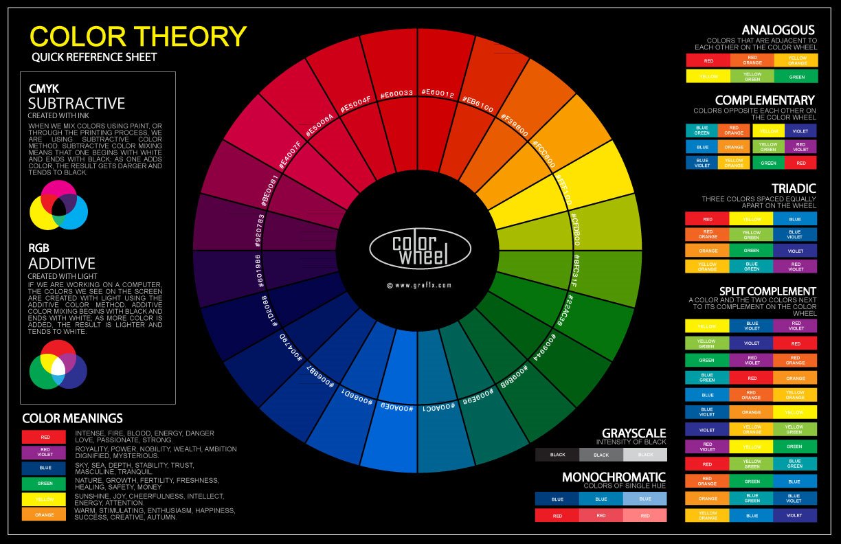
Identifying Stamp Colors
By Don Denman
Introduction
Stamp colors are probably the most confounding areas of collecting. And it is very tempting to use technology to help us find answers to our color questions but there are many issues and short-comings surrounding accurate color representations when using technical solutions.
Before we begin discussing the technology we should mention some of the ‘human’ color challenges. What one person may see as red another person may see as scarlet. This can be explained by the fact that we all have a unique number of cones and rods in our eyes. Additionally research has proven that men and women see colors differently. Another important factor is that how we see colors is greatly impacted by the ambient light conditions we view it in. Viewing a stamp under ‘office lighting’ and then viewing the same stamp under natural sunlight will reveal just how much ambient light conditions influence how we perceive stamp colors. It is not intellectually honest to have a stamp color discussion without defining the ambient light conditions.
And no discussion about colors could be complete without mention of inks and color fastness. A stamp’s color is ephemeral, the chemistry of inks start changing as soon as it is printed. How well a stamp is able to retain its original color is largely dependent upon the environmental conditions is has seen since it was printed. Even if a stamp is kept in a darkened drawer for its entire life certain chemical changes can take place which can change the color of a stamp. Obvious examples are the oranges inks used on many stamp at the turn of the century.
Another thing to keep in mind is that we rarely know what a stamp has been through during its lifetime. Environmental conditions, light exposure, and even soaking can all have an impact of the color of a stamp. If a stamp was applied to an envelope, mailed, and the envelope was left sitting on the dashboard of a car or on a desk near a sunny window; it will most assuredly show a color change. It can safely be said that identifying a used stamp color is much more challenging than a mint stamp.
Before moving on to the technical aspects of identifying colors we should mention color ‘names’. It is important to understand that many philatelic publishers have, throughout the ages, never standardized on stamp color names. (A few attempts have been published but none have been universally adopted.) The lack of any universally accepted color nomenclature means that what one catalog publisher calls ‘violet’ another might call ‘lavender’.
Now that we have outlined some of the human color challenges we can move on to understanding how technology impacts our perception of stamp colors. Most online stamp images come from one or two sources; either a digital camera or a scanner. The device uses software to generate the image; how accurately the software replicates the true colors is totally dependant upon this code. The software code’s quality (and accuracy) can vary from manufacturer to manufacturer. Another variable that get introduced is how the image file is saved. Many of the image file formats ‘compress’ the image; this represents another opportunity for software to modify the original colored image. Making matters even worse to the likelihood that users may apply various ‘filters’ or other post processing actions which also modify the original colored image.
And the last challenge is how the image is displayed and appears on the device we are using to view. No two displays, even from the same manufacturer, will be exactly the same. And certainly no two computers, complete with various operating systems, video drivers or applications will display a stamp image the same way. No matter how perfectly a stamp image is generated and saved the outputted image is still totally dependent upon on the display device(s).
By this time you may be wondering why you should even bother trying to identify a stamp’s color. Frankly a good argument can be made that the only valid approach to identifying stamp colors is to assemble a large reference collection of a stamp issue, defining and standardizing the ambient environmental lighting, and developing an good eye for the colors. Hopefully one day technology will help us resolve these challenges by doing a full chemical analysis on the stamp ink; providing definitive identification of a stamp’s color.
How We See Stamp Colors
This article explores how collectors perceive stamp colors and many of the common color misconceptions. It is truly unfortunate that so many catalog and other references use color as a way to identify stamps since it is by far the least reliable and most subjective identification method. The scope of this article is limited to a collector holding a stamp in their hand and looking at it. Trying to accommodate the use of technology (scanned images, saving images, viewing images) is far beyond the scope if this article since it adds many additional layers of complexity.
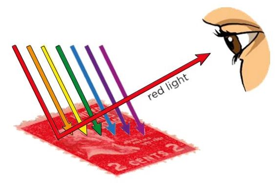
We need to have the correct perspective about colors and where they are generated. Stamps do not possess color but rather stamps reflect wavelengths of light which are perceived by our brains. “We know from psychophysical and neurophysiological investigations that color is created somewhere in the brain, although the exact location of this process is still unknown, and we even have no idea what entities the sensations called color are . . . In short, colors appear only at a first naïve glance to be located in objects.” (Backhaus & Menzel 1992, p. 28) Colors are perceptions and these perceptions differ from one person to another. We can say that color is a ‘psychological property of our visual experiences’ when we look at a stamp, not a physical property of the stamp.
So the first color challenge is that we all have different eyes and brains. The second challenge in understanding how a stamp’s color is impacted by viewing it in different lighting conditions.
Let’s begin by understanding how as stamp collectors we perceive colors. We see colors when a stamp absorbs some of the wavelengths but reflects others. The reflected wavelengths enter our retinas which in turn fire neural connections to the visual cortex. The visual cortex is the part of the brain that converts the signals into a perceived color. Our retinas have two types of cells; cones and rods. The rods are photoreceptor cells which are most activated when in low or dim lighting; most humans have around 120 million rods in a retina. The cones contain color-detecting photo pigment cells, most humans have three types; red, green, and blue (this is called ‘trichromacy’). Each of these approximately 6 million cone cells is sensitive to different wavelengths of light that is being reflected into our eye.
But since the color of a stamp come from reflected light wavelengths this sets up a strange fact. When you look at a red stamp, you are seeing the red parts of the lighting spectrum that is not on the stamp but rather is being reflected off the stamp. The actual color of the stamp is anything but red. However it would be strange to walk around saying “that stamp is anything but red” so we just say “it is red”.
Another interesting fact is that women typically are much better at detecting colors than men because they have more cones in their retinas. It is estimated that 12% of all women actually have a fourth, additional color-detecting photo pigment cell (having four types of cones is called tetrachromacy). People who have this trait can detect as many as 100 million additional colors. And on the other side of the scale, men are more likely to have color vision deficiencies (there are 9-12 different types of color deficiencies). As many as 10% of the male population may have at least one type of color vision deficiency. There are also notable color vision deficiency deltas between geographic and demographic populations. So the take away here is that men are much less likely to correctly identify color than women and that variations between how any two humans perceive a color is almost inevitable.
But how we perceive color is more than rods and cones. As previously stated, the visual signals are sent to our visual cortex. Our past visual experiences with things influence our perceptions of color. This is called ‘color constancy’. Experiments have proven that our perceived colors can be influenced by color constancy. In other words if you look at a banana, you expect it to be yellow and impacts how your brain processes the color you think you are seeing.
Your past visual experiences with objects also influence your perception of color. This phenomenon is known as color constancy. Color constancy is a type of bias that our brains introduce which influence how we are perceiving a color of an object. For example, if you looked at a banana under a red light (making it look orange), you likely would still perceive the banana to be yellow. This influence opens the door to potential mis-identification of a stamp; if you know that a certain color is quite rare, say ‘pigeon blood pink’, your brain may sway your judgement when you look at a stamp.
The ambient light in which we view a stamp has an incredible impact on the color we perceive it to be; even something as simple a ‘daylight’ has a significant amount of variance. For example, the chromatic axis runs from a pinkish-red in the morning, more of a blue-white in the afternoon, and over to red color near sunset. We learned that the colors we see are actually reflected wavelengths so it only stand to reason that the wavelengths of the ambient light will affect our perception. If we view a stamp under a typical yellowish incandescent light bulb it will emphasize the warmer colors because there is additional red and green wavelengths in the light itself to reflect off the stamp and into your eye. But if we view the same stamp under a typical fluorescent light, the ‘cooler’ blue color wavelengths are emphasized. So if you want to be a serious about identifying stamp colors you need to define and be highly consistent with your ambient lighting conditions.
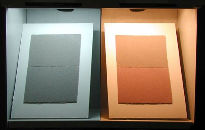
There is also a phenomenon called ‘metamerism’ which occurs when two stamps which are not the same the color but appear to be the same under certain lighting conditions. The image below shows two identical gray samples but how they can appear different colors under certain lighting wavelengths (metamerism). The hues that are most likely to have metameric problems include browns, tans, lilac, gray/blues, and gray stamps.
Additionally, be aware that background colors can influence how you perceive the color of a stamp. The gray bar in the image below is the exact same color across its entire face yet because of the background our brain drives us to see it as being a gradient. When we remove the background and replace it with a solid color, the gray bar now appears to be the same color. This highlights the need to have a consistent background when trying to identify stamp colors.

Lastly, it is important to keep in mind that printing inks and paper colors are ephemeral over time; stamp colors are the definition of a ‘moving target’. Color standards companies like Pantone and Munsell replacing their color guide references every 2-3 years. After hundreds of years of development mankind has not been able to invent inks, paint, or even pure pigments that retain their original color over time. Purchased color guides can only be considered to be accurate for a few years after they are printed. But moreover it is important to remember that the provenance of old stamps is never known. Light exposure, exposure to atmospheric pollutants, generations of soaking, checking for watermarks, etc. all have an impact on the color of a stamp over time.
How To Develop a Good 'Color Eye'
There are a number of thing a hobbyists can do to develop a good ‘color eye’. Below are a few recommendations based upon my experience as a color matcher.
-
1. Define your ambient light sources and never try to judge a stamp color in different lighting conditions.
-
2. To prevent other colors in your field of view from influencing your judgement, use a white card with a cutout in the middle to place over the stamp.
-
3. Never try to judge a stamp color in direct sunlight, the bright sunlight introduces ‘shine’ to the surface of the stamp.
-
4. View a stamp color for no more than 5 – 10 seconds at a time. if you stare at it longer than this, your brain begins to compensate for any perceived differences.
-
5. Define (and adhere) to a distance that you hold the stamp at, the stamp surface should be held at approximately a 30-degree angle to light source.
- 6. Build a large reference library of the same stamp and refer to it often to keep your color eye tuned.
Color Extractor
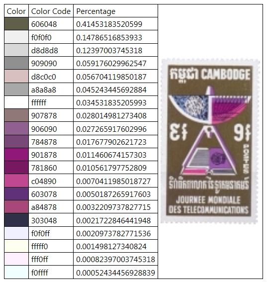
Upload your own image to view the html color code and percentage of color.
Tips
1. Crop your image to just the stamp design to limit background color identification.
2. To reduce processing time, limit image pixel size (resolution) to less than 1600 x 1600
3. Your images are not visible to others.
Digital Imaging
for
Stamp Collectors
Introduction
Digital imaging has become an important aspect of philately. Computers, tablets and phones have become a common mode of communication for stamp collectors so it is important to understand how to properly generate, process, and share images. We first should start with understanding some of the common terms used in digital imaging.
Common Terms
Resolution – Image resolution is typically described in PPI or DPI, which refers to how many pixels or dots are used per inch of an image. It has a direct relationship to the sharpness and clarity of an image. PPI is used when describing images displayed on a screen, DPI is used when describing printed images. Scanners resolution is also usually discussed using DPI, scanners recognize the color at a specific row and column on the stamp as it is scanned. Here is a table of typical pixel sizes and dpi
Pixel - An invented word derived from "picture element". It does not have a defined size but is rather the most basic unit of programmable color on a computer display or in a computer image. Digital images are made up of many pixels, all coming together to form the image we see. Pixels are more of an abstract representation of a specific coordinate, like a point on a map. A good way to think of pixels is to think of a crowd at a football game all holding up a card to form an image, each card can be thought of as a pixel.
Typical Display and Capture Devices
| Device | Pixel Size | DPI |
| Football Stadium | about 2 square ft. | 0.041 |
| Giant Scoreboard | about 1 ½ inches | 0.66 |
| 50 ft Digital Cinema Screen | about 1/3rd inch | 3.33 |
| Computer Display | about 1/75th of an inch | 75 |
| Computer Printer | about 1/300th of an inch | 300 |
| Digital Scanner | ~ 0.00083 inch | 1200 |
| Digital Camera | ~ 0.00035 inch | 3500 |

|
To determine the DPI resolution of your current display setting, measure the width of the red line above with a household tape or ruler. Consult the table at right to locate your measurement. The result will be about four inches on most monitors. This is a common measurement and explains why you will often see 75 DPI used when discussing display resolution. |
|
Megapixel – One megapixel is a million pixels and is often used to communicate is a unit of image sensing capacity in a digital camera. The higher the megapixels, the better the image resolution when displaying or printing an image in a given size.
Lossy – This is a term which means “with losses” and is often used to describe image file formats that discard data due to compression.
Lossless – The opposite of lossy, used to describe an image file format that retains all the data from the initial image file.
RGB – Stands for Red, Green, Blue and is a common color model used for display devices such as monitors. Each displayed color is determined by a combination of Red, Green, Blue.
CMYK – Stands for Cyan, Magenta, Yellow, and Black and is a common color model used in color printing process.
Bitmap – (Also known as Bit-mapped or Raster) Images which use pixels to describe the color. A notable characteristic of bitmaps is that larger images equals larger file sizes. Another characteristic is that a bitmap image cannot be rescaled without resulting in “pixilation”, or loss of definition in the details. Examples of file formats which are bitmap are JPG, GIF, BMP, PNG.
Vector images - Vector images are math, they use data to describe lines and curves. One of the greatest attributes of vector images is that they can be resized without “pixilation” or any loss of details. They are typically used for line drawings like logos and word art. Examples of vector file formats which are DXF, DWG, AI, and CDR. Vector files are outside the scope of this article.
File Formats
There are a number of ‘common’ bitmap file formats that support the exchange of images. There are also a number of proprietary bitmap formats (i.e. Photoshop PSD files) which fall outside the scope of this article. Each of the file formats have pros and cons and these tradeoffs are important to understand. The following formats detailed below are readable in both Windows and Mac OS operating systems and are supported by most image viewing and editing applications.
TIFF – TIFF is a lossless file format that is widely supported across operating systems. TIFF is the best file format for archiving high quality images since it does not lose any information. On the downside, TIFF file sizes are very large and they consume a lot of storage space.
JPG (or JPEG) - The JPG file format was specifically created for photographs and they support millions of colors. JPGs are by definition automatically compressed when you save a file. In many applications you can select the level of compression to match the desired level of image quality. JPGs are lossy, discarding information each time that they are compressed. The more the compression, the lower the image quality and the greater the reduction in file size. JPG are typically the preferred format for email and Web use.
GIF – GIF format is a compressed file format limited to 256 or fewer colors. They are generally not recommended for photographs but instead used for images like clip art. GIFs can be static or animated.
PNG - PNG, also known as Portable Network Graphics is a format which is designed to provide a higher lossless compression rate than other formats and to and help to reduce cross-platform differences in image display quality. The resulting file size is often quite large and this makes it less likely to be used in exchanging images or using on websites.
Generating Images
Producing a digital images can be done in several ways including scanning and cameras.
For many collectors scanning is the ideal method for generating images of stamps. A scanned image of a stamp will always be flat and without the possible distorting angle of a camera position.
A common mistake that people make is scanning
with lid open. This means that any ambient light entering the scan bed will
change how the scanner works. When scanning, the CCD array determines the
amount of light being emitted from the lamp and the reflected light from what
is being scanned. The scanning software uses averaging algorithms and its
calculations expects the lid to be closed. In fact, the manufacturers calibrate
the scanner and the software to work specifically with the exact color of the
underside of the scanner lid as a reference point (most often white). It is
also not expecting ambient light entering the scanning area.
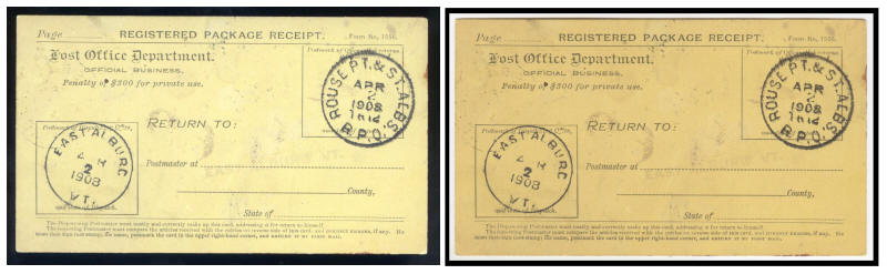
Here are two identical scan, the only difference is one with lid open and one with lid closed; note the signifcant color shade differance.
If you are trying to get highly accurate dimensions of a stamp you should not place the stamp on the outer edges of the scanner glass (platen). Many scanners are “plug and play” and come bundled with software which allows you to modify images by making them 'sharper' or more 'colorful'. To generate the most accurate image of your stamp avoid using these software imaging enhancements.
Do not bother setting the scanner to scan at
48-bit color, use 24-bit color. While technically having more bits per channel
is better, you cannot see the difference becausemost monitors can only display 24-bit color. It is like
playing a Blue Ray movie on a standard definition TV. Additionally, the only
common 48-bit file format is TIFF. If you save the file in another format like
JPG it will convert the color channels back to 24-bit anyway.
Digital cameras and camera phones are one of the easiest way to produce digital images but performance and image quality can vary very widely. (For example, there is a significant difference between a consumer digital camera and a professional camera.) Digital camera are sometime very useful if you intentional need to take an angled image; a good example is to capture a grill on early US stamps. The camera angle will reveal the raised ridges of the grill better than a flat scan might. But in many cases you would want to limit any angle of the camera by holding it as close to 90 degrees as possible.
Image Resolution and Image Size
We have already described resolution as referring to the sharpness and clarity of a stamp image. This applies whether you are scanning a stamp, viewing a stamp image on a display, printing a stamp image.
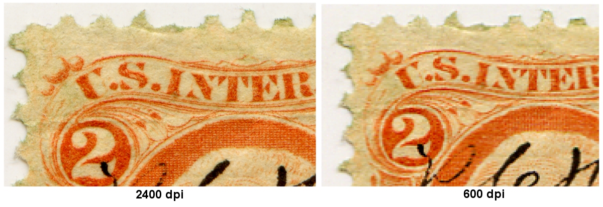
When scanning a stamp you are usually prompted to select a resolution to scan at. Typically you should not scan at less than 150 dpi but preferably 300 to 600 dpi; this generates a good quality image which can be used for many purposes. If you desire a very high quality image consider using the largest resolution your scanner can produce. But be aware of the difference between your scanners true optical resolution and the heavily promoted maximum resolution. Scanner manufacturers can advertise a much higher scanner resolution be adding what is called interpolated resolution. Interpolated resolution is simply a software enhanced resolution; it is no different than using software to greatly enlarge an image after scanning. Find out your scanners maximum optical resolution (in User's Guide or on box) and do not try to use anything larger.
Keep in mind the intended use of the image you are generating. In some cases you may only be generating a stamp image to email to someone of to post on a forum. In these cases there may be file size limits and you will need to scan at 150 dpi to keep the file size small. At other times, file size is not important to you and you may want to start with the highest quality image you can generate.
Using what we have learned, you can generate the highest quality image by using the maximum optical resolution and then saving in an uncompressed image file format like TIFF. Once you have a foundational high quality image saved, you can always make a new lower, small sized and compressed image like a JPG. But note that you cannot make a higher quality image but using a low dpi or compressed image by enlarging it without encountering pixelation.
If you know the pixel width and height of an image, this section will calculate the physical size (in inches) of the image when it is printed or displayed on various devices. To use the calculator, enter the width and height, then select the output resolution which will be used. * Most monitors display images at approximately 75DPI. To check your own monitor, use the chart above.