Easy Identification - US 1875-1894 Newspaper Stamps
By Bill Weiss
This article will attempt to help the reader to better understand these issues, which often confuse even advanced collectors and dealers.
The key to successfully correctly identifying these stamps is the ability to identify the PAPER and COLORS. A basic understanding of the differences in PAPER TYPES and in COLORS is essential.
HARD PAPER – Stiff, whiter than soft paper, not translucent when held to light (the paper weave appears more “solid” than soft, which has a distinct mesh) , appears whiter under UV long wave light (because it is less dense than soft paper), perf tips appear more solid when viewed with good (recommend 10-15X) magnification than soft paper (which will display more paper fibers on the perf tips). Detect hard paper by observing the traits already noted. Some people can also ID hard paper by “flicking” the edges and feeling the stiffness of the paper versus the softness of soft paper).
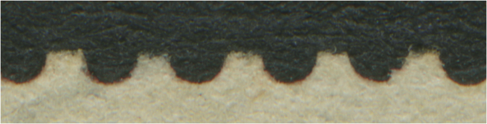
Hard Paper Perf Tips
SOFT PAPER – A looser-weave paper than hard, so feels softer, displays a weave when held to light, looks grayer under UV light than hard, and shows lots of perf tip fibers with good magnification.
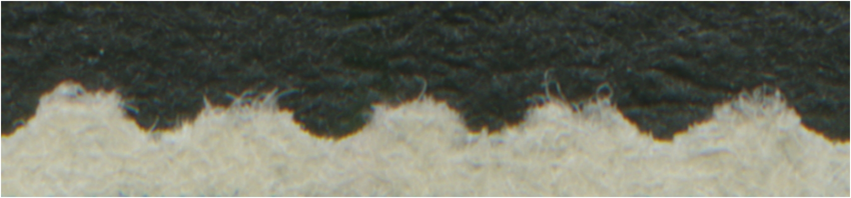
Soft Paper Perf Tips
Tip – Inexpensive examples of hard paper are any U.S. Regular Issue stamp between 1857-1873 (least expensive is 3c 1861 (Number #65) or 3c 1873 (Number #158) and for soft paper any stamp issued between 1879-1893 (least expensive is Number #210 or #213
COLORS
(Colors are those designated by the Number Catalog. Listed here are only those which sometimes are confusing or difficult. We will attempt to simplify them for this article).
12c THROUGH 96c VALUES – THE “RED” COLORS
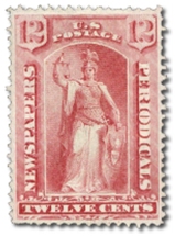
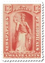
ROSE is the color of the red-shade 1875 regular Newspaper Issue 12c to 96c denominations. The color rose used in this issue comes in two distinct shades, a soft-color, and a harder or deeper color, which is closer to a carmine shade. The color “rose” as used in philately, generally denotes “softer” and lighter shade of carmine. Even though it is somewhat difficult to put colors into words that can help you ID a stamp, once you compare the different red shades used in the Newspaper stamps, the job of identification will be much easier. The red/carmine/rose color shades of the 1875 issue are completely different than the following issues, and since only the 1875 Issue is printed on HARD paper, it makes ID of these color shades much easier. If the stamp is on HARD paper, it is from the PR9-32 set, unless it is a Special Printing, which we will describe next.
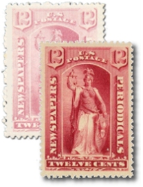
 Carmine/Rose Shades
PALE ROSE is the color of the 1875 Special Printing 12c to 96c values. Unfortunately, the regular 1875 issue also comes in a paler rose shade, so the only way to identify the Special Printings is by the combination of the color shade AND the paper color (which is brighter and “whiter”). The paper also appears to be whiter under UV light. Since this issue is also on hard paper, it cannot be confused with later issues, which are all on SOFT paper.
 Pale Rose
RED is the color of the 1879 Issue 12c to 96c values. In my opinion, a more accurate description would be “orange-red”, but either way, it is significantly different from the earlier ROSE shades of the 1875 Issue and the CARMINE or PINK shades of the later issues. Since the 1879 set (PR57-79) is on SOFT paper, it should not be confused with the earlier Issues, so once you can separate the colors, you can accurately identify them. The best way to build a small reference collection which you can use to compare with future acquisitions is to purchase an example of each shade by buying them already with expert certificates. Usually, copies of the lowest-priced examples can be found with small faults at a fraction of the Number prices. This will be a sound investment to aid in your future identifications.
 Red
Red
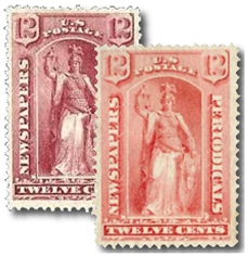
CARMINE is the color of the red shades of the 12c to 96c 1885 Issue (PR81-89). Since these stamps are also on SOFT paper, you only need to be able to differentiate the carmine color of the 1885 Issue from the red color of the 1879 Issue, as the next Issue (1894) is PINK and is dramatically lighter and different than any of the previous red shades. The carmine color of the 1885 issue shows no evidence of any orange.
PINK is the color of the 1894 Issue and, as noted above, is dramatically different (lighter) than any previous Issue, so presents no real ID problem, and all of the 1894 12c-96c are very scarce, to very rare, and it is unlikely that you will encounter this Issue, but if you do, it is rather easy to ID.
 Pink/Carmine
1c THROUGH 10c “BLACK” SHADES
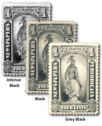
BLACK, GRAY BLACK and INTENSE BLACK are the different shades of black found on the 1875-1894 Issues. . Since only the 1875 set was printed on hard paper, any black stamp of Number Design N4 on hard paper must be PR9-15 or PR33-38 (Special Printings).
Tip- There are three low values (2c,3c,4c) Special Printings that exist on ribbed paper, so watch out for those, as ONLY the Special Printings are found on ribbed paper and they are substantially more valuable than the regular 1875 stamps
The 1879, 1883 Special Printing, 1885 and 1894 sets all have values which are black or, in the case of those after 1879, intense black. That shade is, as the name implies, is much darker than either black or gray black. The 1883 2c special printing is intense black, has clear impression, soft paper that does not display any weave when held to light and “hairy” perf tips typical of stamps on soft paper issued without gum. So the difference between the three issues on soft paper is possibly the most difficult for collectors to correctly ID, but if you become proficient in identifying Intense Black, then paper is critical. The 1879 set has soft paper which shows lots of weave when held to light, the 1883 2c is already described and the 1885 set has soft paper without much weave.
Summing up the 1875-1894 stamps of Number Designs N4 to N14 (PR9-101) and when confronted by one of them, first identify if on soft or hard paper and proceed from there. All of the higher values pose little problem – they are either on hard paper (PR24-32 or PR48-56) or soft (PR71-79 or PR99-101). And the last three are so rare that you will likely never encounter them.
So if a lower value, then colors become critical and you must be able to identify and differentiate between the black shades and the red shades. Hopefully, the descriptions provided here will help.
And to conclude, the difference between the 1895 sets (Number PR102-113 and PR114-125) is simply that the first set is watermarked and the last is not. The watermark is very often extremely difficult to see on the stamps that are vermilion (PR108) and dull rose (PR112) and even sometimes the 25c and 50c carmine shades (PR106-107). Be especially careful if an unused stamp is regummed as often it will conceal the watermark, making it even more difficult to detect than otherwise.
An additional printing of the high value 1895 set (unwatermarked) was issued in 1899 (Pr121-125) but they are virtually not distinguishable from the earlier set, so you need not be concerned with them other than to know they exist.